|
| 
|

7) Exterior Lighting:
With UT2Kx’s introduction of the Terrain
tool for modeling the ground, more and more exterior levels
were born, hence the reason to provide level designers with
the appropriate tools for this kind of level. Here, the actor
we are most concerned with is the Sunlight Actor: this must
be placed in the Skybox, and will thus illuminate the level
only through the BSP surfaces set to Fake Backdrop. Therefore
if you do not see the light after having placed the actor and
Built Lighting, then there’s a good chance that the problem
comes from either the actor being in the wrong location, or
the flags on the BSP are set incorrectly.
What’s the difference between a normal Light Actor and
a Sunlight Actor? The first has a limited range, but lights
in 360°. The second has an unlimited range but lights in
only one direction: the rays of light it generates are all parallel
and, therefore, all its shadows are as well. Just like a StaticSpot,
it will need to be pointed in a specific direction. That’s
all. Even though their differences are small, their results
are spectacular and extremely practical. Whereas in Unreal
1 and UT99, the designers had to fight
with numerous Light Actors, generally with LE_Cylinder and bDirectional
= True, in order to direct them in a specific direction, it
is possible now to only use one. The time savings is therefore
considerable.
You can, of course, and to some extent it is even expected,
use each of these actors according to their specialization.
Just because a level has a sky doesn’t mean that the light
‘falling’ on the level must come from a Sunlight
Actor. (Yet, now that I think of it, is the light from a sky
obliged to ‘fall’ on a level? Is there a reason
other than pure realism to avoid creating a level where the
light comes from under the players’ feet? I’ll let
you develop that idea: an inversion, the basis of all sorts
of contrasts from a certain point of view is often a great source
of creativity). People who have spent a long time designing
with UEngine 1.0 often have a wide palette
of techniques at their disposal because they’ve had to
learn how to circumvent the difficulty of the lack of a Sunlight
Actor. Rogelio Olguin, alias Desperado#2,
gives us a brilliant demonstration of not using the Sunlight
Actor:
|
|
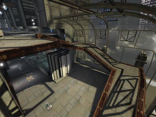
This level, a completely spectacular and vibrant
testimony of a real talent, is entirely lit with the ‘old-fashioned’
method. In spite of the many views of the imposing Skybox, you
will not find any Sunlight Actors here. Why did the author ignore
a tool as practical, as precise, and as reliable? Because the
author, I believe, illustrated his particular gift by preferring
to ‘draw’ the shadows himself rather than allow
a machine to do it for him. The Light Actor, which is in the
area above the wide picture window, lights in all directions,
although not exactly since its property assigns it to a LE_Cylinder.
However, the fact that its shadows are not exactly parallel
makes it possible to introduce more subtle shadow effects, despite
being less mathematically exact; compared to that of a Sunlight
Actor, in this area. Another reason also relates to the propagation
of the windows all around the map. It was impossible for the
author to use a Sunlight Actor without avoiding a huge headache.
Thus an author who knows what he wants in terms of architecture
manages to circumvent his lighting problems with a simple solution,
the best one of all. It is worth noting that the attitude of
Desperado#2 is the opposite of that which I
described at the beginning of the tutorial. Namely, that it
is necessary to think about the architecture of a level according
to its lighting and not the reverse. However, this wasn’t
the author’s first try, and I believe I’ve already
told you that art is not an exact science.
Some tips worth knowing regarding the sun and, in general,
light from the sky:
- It goes almost without saying that the position of the
sun in the sky varies according to the time of day, the latitude,
and the seasons.
- Since the Unreal Engine doesn’t manage
radiosity, Ambient Lighting is certainly expected in an exterior
location, but is not necessarily essential depending on your
control of the lighting.
- A simple Corona texture from one of the official texture
packages is enough to represent the sun in the Skybox. It’s
not necessary to model a static mesh for the kind of ‘detail’
that few players will pay attention to; unless your level
is located very close to a star or even on its surface.
- Sunlight is not White. Make it, instead, an off-White,
pale Yellow where the Yellow dominates. This is the reason
why one resembles a corpse when looking at oneself in the
bathroom mirror under a fluorescent light, as they’re
generally completely White. It is also for this reason that
painters worthy of the appellation always work with natural
light and not that of a candle or, worse, a flashlight (a
problem will really doesn’t concern you since you normally
work with a screen where images are unaffected by ambient
light, but it’s still good to know if you ever try to
express your creativity in another medium).
- Moonlight is almost the same color as sunlight since it is
sunlight reflected off the moon and comes down to us; although
I will admit it is a hair darker - taking into account the grayish
color of the lunar surface. On the other hand, the quantity
of light that returns to us is directly proportional to the
moon’s size: a half-moon will not reflect as much light
as that of a full moon, for example. In all cases, however,
it can never equal the amount of sunlight, for obvious reasons.
Additionally, night environments are often lit by a Blue hue
– probably because nights are ‘fresher’ than
days - and it can be a refreshing change to bend realism and
to use a lot of Blue to represent lunar light instead of lots
of Yellow. But the choice is up to you in the end…
- Light from other planets and from the stars is practically
negligible, but if your night is moonless, then it can be
permissible to ‘distort’ the light to avoid having
too dark a level.
- With cloudy weather, sunlight tends toward Blue –
it darkens. Therefore, and especially so, shadows become more
diffuse; a detail often forgotten. If it is an all-encompassing
storm, on the other hand, then there is no risk in using a
dark Grey.
- Various floating particles, that simple Fog can represent,
will probably have an influence on the color of the sun; even
tinting the light towards orange and even chestnut. Note that
on our planet the color of an oxygen molecule (an azure Blue)
affects most of the color of the sky and therefore significantly
affects the color of solar light (in space, sunlight is more
raw; see recent reports on space exploration for more details).
As for extraterrestrial planets, well, it’s your choice…
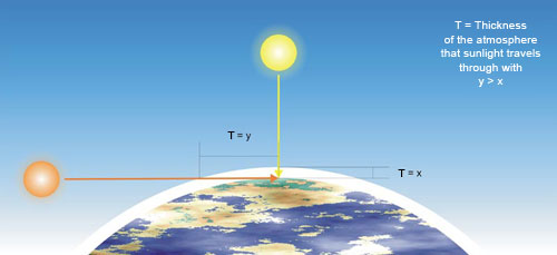
- At dawn and twilight, sunlight tends towards Orange, or
straight up Red, much more than Yellow. It will certainly
not be as pale as at midday either. The reason is due to the
position of the sun in the sky and therefore the thickness
of the amount of atmosphere the light must pass through. The
more atmosphere, the more the light retains colors until nothing
remains but the Reds (once again, these colors vary drastically
on other planets according to the base color of the star –
there could even be several – and the atmospheric composition
of the planet involved). See the following diagram for more
detail:
|
|
- And, while I'm at it, it's the exact opposite
for underwater lighting: light tends towards blue the deeper
you dive; not because water is blue (it actually has no color
at all: when you see the sea or the ocean as blue, you just
see the color of the sky reflected on the water's surface),
but simply because water has the physical property that absorbs
Red…
8) Shadows: Some tricks
worth knowing…:
Shadows are fundamental to create certain basic contrasts, therefore
you can use them to ‘dress’ empty areas of your
level; the principal advantage of this being that they do not
require additional polygons or textures. Thus they are fairly
cheap in terms of FPS while also removing potentially annoying
flow blockers from the gameplay. It is the inverse of the process
presented in the section devoted to the use of the LE_StaticSpot
in DM-Oceanic above. Some examples:
|
|
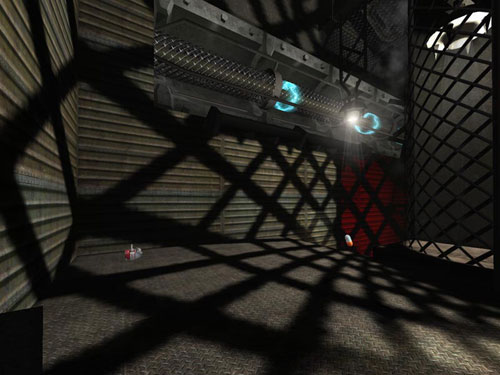
Here, in DM-Leviathan, a quarter
cylinder static mesh and a simple alpha-masked texture, seen
to the right of the screenshot, allows the light from the Light
Actor to pass through only in the transparent areas of the texture.
This projects shadow effects which give this slightly plain
corridor a more interesting aesthetic. Also note the effective
use of ‘Red Light’ in this area…
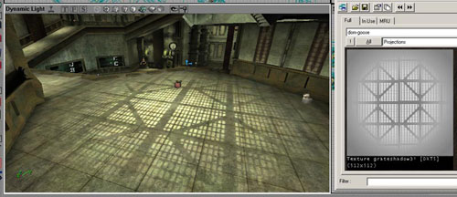
|
|
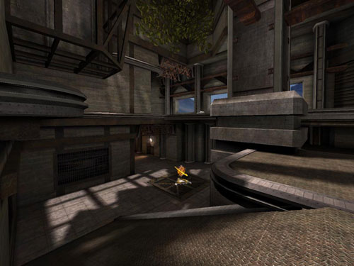
In DM-DE-Ironic, see how the
grid-shaped static mesh which decorates the floor with light
projects a network of shadows dressing the floor and walls.
Even if this trick doesn't interest you, it is still necessary
to adhere to certain restrictions both technical and artistic:
- The first relates to the ‘weight’ of Lightmaps.
This is often over-estimated in terms of performance; the
problem stems from, especially, the size of the total file
and the implications thereof (download time, hard drive space,
etc…). I thus recommend that you set all the surfaces
you are sure will never be seen to Unlit (including Fake Backdrop
surfaces).
- The quality of a shadow is inversely proportional to the size
of the BSP surface on which it is projected: the larger a surface,
the worse the quality of the shadow. Thus, try to keep to smaller
BSP surfaces or, if you notice artifacts you don’t know
how to get rid of on a BSP surface, try reducing the size of
the corresponding brush, for example by dividing it into different
pieces. Thanks to djsilt, from what forum I
no longer know, who helped me figure out this problem and who
gave me the answer from which you can all profit now.
- The distinction of a shadow depends on the distance between
the caster and the surface on which the shadow projects. You
can experiment with this at your own home: place your hand under
your desk lamp. You will notice that as you bring it closer
to the desk, the more distinct the shadow becomes, whereas as
you move your hand away from the desk, the shadow becomes fuzzier.
You can simulate this by modifying the properties of the BSP
surface’s Light Map (in the Pan/Rotate/Scale property
box). The closer the surface to the shadow caster, the lower
the value will be – usually about 32. But be careful with
this, first because of the problem indicated above and second,
because sharp shadows are very rare in reality, even though
some may find them very pleasant, and finally because ‘cutting
up’ all the walls in the level into multiple BSP surfaces
quickly becomes tiresome, and expensive in terms of polycount.
It should be noted that the judicious use of Projectors makes
it possible to obtain similar results without having to edit
the properties of multiple BSP surfaces. For example, in DM-Compressed:
on the left, the Projector as seen in the level, and on the
right, its corresponding texture – note that the edges
become fuzzy in order to simulate the distance of the gird away
from the light source.
|
|
Changing a Light Map’s properties affords
us an excellent opportunity to more closely examine the compression
algorithms of the images. Contrary to appearances, bitmap images
are not ‘square’, but are simply a line of pixels.
In an 800x600 image, for example, the image is a line that is
800 x 600 = 480,000 pixels long. The program used to view the
image, when ready to display it, will count 800 pixels out and
then will ‘cut’ the line at the 800th pixel and
then continue counting again below the first pixel. It will
count another 800 pixels again, and then will ‘cut’
the line again, drop down one, and start counting again until
the last, 480,000th pixel. The render of the final image will
consist of 600 lines with 800 pixels in each. If you’ve
worked on very large images that are resource-heavy in the past,
you may have noticed that when the image is refreshed after
a change, it looked like lines of text propagating word after
word. This is, in fact, exactly what occurs, the only difference
being that it uses pixels instead of letters.
This ‘line’ in bitmap images thus allows compression
algorithms to be created. A format like .bmp, for example, does
not compress: the corresponding file retains the details –
thus values of RGB, or CMYB depending on the color spectrum
used – of all the pixels that form the image. A format
like .jpg, contrarily, ‘combines’ the pixels that
share the same color. If part of the image is white, the line
of pixels stored in the file will retain only the color value
of the first pixel. It will then declare the rest of the pixels
in that line that are the close to the initial color the same
color as the first pixel and will ignore the precise values
of each individual pixel. An extremely simplified example:
|

|
In this case, the compressed format will retain
only two pixel colors: White and Black. All the pixels the closely
match the first white pixel will be declared identical to the
first until the line arrives at the first black pixel. At that
point, the change to black will be noted, and then that color
will be assigned to all others along the line that are close
to the initial black. As an experiment, you can save this image
after having turned it 90°, and then save each of the versions
of the image, both horizontal and vertical, in a non-compressed
format. Compare the file size of each and see the difference.
The creation of custom materials is supposed to account for
such advantages. If you create a skin for a static mesh, or
a texture for BSP, try to exploit the compression algorithms
in order to reduce the file size of the final image. I’m
not trying to encourage you to create skins and textures made
of horizontal patterns, but sometimes making a simple 90°
rotation before saving can save you significant file size, with
all the advantages that implies…
9) Various tips and shortcuts:
a) ‘Pitch Black’ (or completely dark)
This old trick consists of leaving certain portions of the map
black in order to allow the spectators' imaginations to populate
the darkness with what they want to see. The masters of the
Dutch school of claire-obscure are the most well- known practitioners
of this. In level design, the advantage is that it can save
on details and reduce the resources used (like textures and
polygons). The history of the FPS abounds in examples: for example,
in the anteroom of the Skaarj queen in Unreal
1, or, more recently, many areas in Quake 4.
In UT2K4, a good example can be found in the
ceilings of CTF-BridgeOfFate.
|
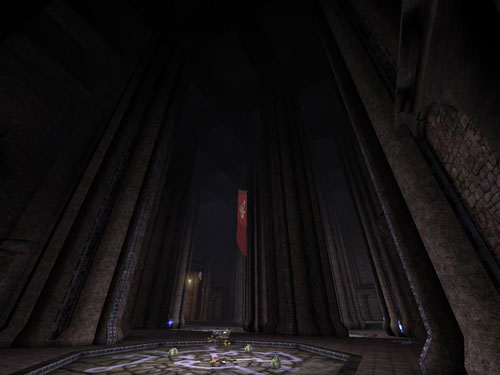
|
And, since inversion is always useful to artists,
the central chasm of the same map shows the same method.
|
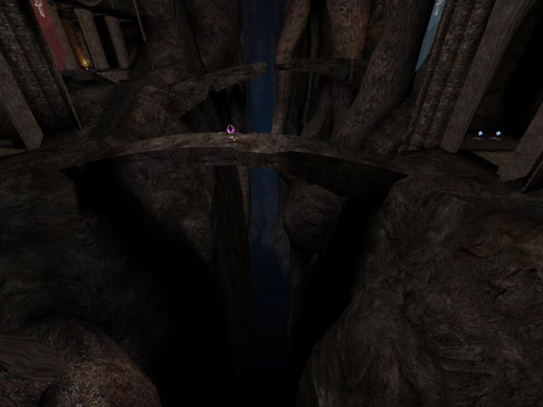
|
While following inversion, which is the base
of all contrasts, you can always replace Black with White (while
being careful not to dazzle players too much). Thus, we see
this in Rogello ‘Desperado#2’ Olguin’s
DM-CBP2-TelMecoMEX.
|
|
b) Coronas:
These objects are often confused with Lens Flares which one
finds in the majority of 3D programs. Coronas are textures of
light halos that one can assign in conjunction with a Light
Actor to simulate the brightness of the corresponding source.
They can add a hard to contest touch of realism, especially
for those levels with humid or misty atmospheres, since such
halos occur in reality, especially when ambient moisture diffuses
the light immediately around the source.
Some specific tricks:
- Their influence on performance is not negligible. One corona
per source is more than enough. If you misuse them, you will
encounter severe drops in FPS, but you will obtain a touch
of realism in return. For this same reason, don’t feel
obliged to allot a corona to each light source in the level:
it’s a trick, not an indispensable ingredient.
- Place coronas close to the surface of the light source and
at its center. There is nothing more unreal (no pun intended)
than a corona floating in mid-air. Take the time to position
the corona appropriately as regards the light source and not
leave a gap between them. This kind of mistake is visible more
often than one would think during a game... This being said,
the use of coronas doesn’t stop with light sources (perhaps
the glow a fusion engine gives off, for example…). Thus
for other cases it can be, of course, that the corona isn’t
touching anything at all.
- Coronas are not visible in the Skybox. You will thus not
be able to use them to simulate the sun, the stars, or anything
else. It will be necessary to place a corona texture on a
brush or static mesh so that it’s visible in the Skybox.
On the other hand, you could use a corona to simulate the
sun if it’s in the level proper, instead of the Skybox.
The result, while being rather spectacular, can sometimes
be a little too dazzling. If so, then adjust the size and
position of the corona so that the simulated sun gives the
impression of being ‘infinitely far’. This will
not always be possible because you’ll want to avoid
the potential for migraines in a detail that few players will
pay attention to because it’s a little ‘too high’.
- By default, the size of a corona is fixed; i.e. its size on
the screen does not vary based on the distance one observes
it at. This can be annoying for players depending on the circumstance
(they can easily dazzle, see the screenshot from DM-CBP2-TelMecoMEX
above). In order to solve this, the developers added certain
properties to coronas in UT2Kx: Properties
light -> Corona -> MaxCoronaSize and MinCoronaSize which
will enable you to ‘fix’ the size of the coronas
to suit you. Having spent a long time in UEd
2.0 learning more about coronas than one would
want, believe me, this trick is very practical, but do not misuse
it; most of the time the default settings are completely adequate.
Don’t bang your head against it seeking absolute realism,
you won’t find it with this version of the Unreal
Engine anyways.
c) Fog
Fog is one function of the Unreal Engine that
was greatly improved over its previous UT99
model. Many level designers used it on their first UT2K3
levels, and it should be admitted that this function has many
practical uses, both on the technical side, and on the artistic
side. First, it can have a beneficial impact on performance,
in that it hides assets from being rendered outside its radius.
Second, it for the realism it adds; objects become mistier and
blend into the fog color as one moves away from them since the
thickness of the atmosphere obscures more. Unfortunately, Fog
is not always your friend. By removing some of the clarity,
it can destroy contrasts and dilute colors, therefore ruining
certain effects. Therefore use it intelligently because a light
fog can reinforce an environment’s atmosphere, but it
doesn’t create it by itself.
Another problem with Fog has to do with the properties of
Zones. If you create a Zone with Fog, and create a Zone without
Fog next to it, when you pass from one to the other, the Fog
will either appear or disappear suddenly. It will always be
too visually brutal unless you use the same exact Fog properties
throughout your level which can cause problems either early
on, or later. You are supposed to be the Master of your project,
not its slave; it is not the level that directs you –
you control the level. Thus, you will find a very practical
property in ZoneInfo Properties -> ZoneLight -> DistanceFogBlendTime.
This makes it possible to control the time over which Fog
will appear or disappear when entering/exiting a Zone with
Fog. Adjust it according to your needs.
You can also use an intermediate Zone where Fog will become
less important; kind of like a ‘buffer’ to a certain
extent. This can be used to gradually increase or decrease
the Fog between contiguous Zones by slightly adjusting the
values in each Zone. However, this can quickly become a headache
and will also send you back to using DistanceFogBlendTime
usually. It goes without saying that you can, of course, mix
these two methods.
Note: Fog present in one Zone will not be visible from other
Zones. There is nothing you can do about this as far as I
know. If you do come across a solution, don’t hesitate
to write me.
d) Lighting for Team-Based levels (CTF, DDOM, Br, …):
By now, you may have already understood why Team-Based lighting
colors are Red and Blue: they are, quite simply, the opposite
colors in the RGB spectrum.
It is rather common to use the dominant Reds for the red team’s
base, and the dominant Blues for the blue team’s base,
however, alternatives should be handled with caution. I’ve
often seen levels where these colors are not combined in a very
pleasing way. White can accompany Blue well; however, this is
not the case with Red. Once faded, Red becomes diluted and functions
‘badly’ (once again, we return to the principle
that Red Lights should only be used in the darkest corners of
a level), when Blue is often already considered pale in our
minds (a habit which probably comes from seeing the azure blue
of the sky…). Therefore, I would recommend that you mix
the Red of the corresponding base with Yellow, since Green would
produce too strong a contrast, but nevertheless possible if
the color chosen is not too strong but sufficiently pale enough
to avoid clashing too much.
Additionally, it is not always necessary to use Red and Blue
exclusively to color the bases of your Team-Based level. In
the past, some designers have tried using different colors,
and even played with textures (a level for UT99
called CTF-Times, the name of the author escapes
me, knew how to exploit contrasts in such a way that, I believe,
made some impressions). More recently, the multiplayer maps
from Quake 4 clearly demonstrate that Orange
and Green produce a contrast sufficient enough to replace Red
and Blue, respectively. Do not hesitate to explore other possibilities.
You can play within the boundaries of the map theme too. For
example, a twilight sun, thus tending toward Red, can use Orange
and Red as a base color, whereas the opposite base, placed such
that it is back-lit, could be tinted Blue and Green. Conversely,
if the level is in orbit around a blue star, invert the situation
where the Blue base is directly lit and the Red is placed in
half-light.
e) The ‘Lruce Bee’ technique:
Lruce is an author for whom I have great respect. Not only are
his works counted among the most successful in the community,
(see DM-Victoria for UT2K3
if you still believe that only static meshes and custom textures
can personalize a level) but he is also a human who could serve
as an example to certain people.
The technique he developed consists of maximizing all the
lights in a level (in terms of each Light Actor’s Brightness)
and then lowering their Brightness values gradually until
an adequate lighting level is reached. This technique is the
‘reverse’ of the normal method – and it’s
useless at this point to elaborate on what I think of inversion.
This makes it possible to avoid overly darkened areas with
too-timid lighting despite an author’s best intentions.
This unusual technique presents one problem for the beginner
level designer: it very easily creates ‘greening’.
This ‘greening’ is a defect of the lighting system
which occurs when a surface receives too much light. When
this occurs, the surface becomes tinted with a particularly
unpleasant greenish-yellow hue which has nothing to do with
the colors of the Light Actor(s) that light it. Therefore,
if this happens, adjust the Brightnesses of the surrounding
environment.
Conclusion:
That’s about all I can say to you regarding lighting
in UEd to the extent of my knowledge. It goes without saying
that this tutorial does not contain every possible and conceivable
technique available. I just hope that you will have the occasion
to retain two or three tricks which will be useful to you
some day. If certain details were not very clear to you, or
seem to deserve additional explanation, do not hesitate to
contact me via pm on this forum, and I will try to make things
clearer.
Now, launch UEd and get to work!
|
 |
|
|
|


|